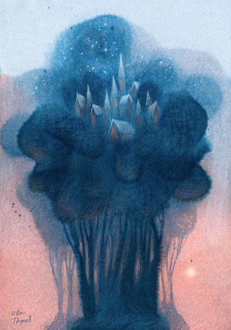
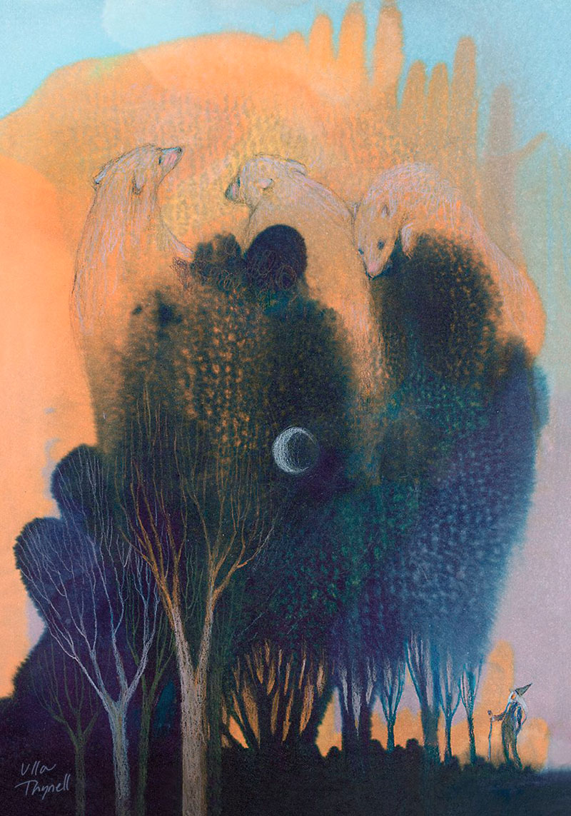
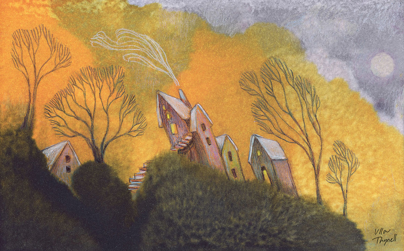
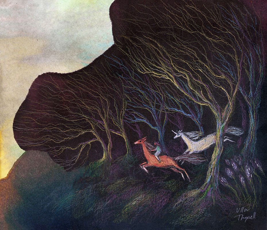
In this article I’m going to show you one of the painting techniques I use, combining alcohol based inks and coloured pencils. For more illustrations in this style, check out my art book Woodlands!

Going Wild with Marker Refills
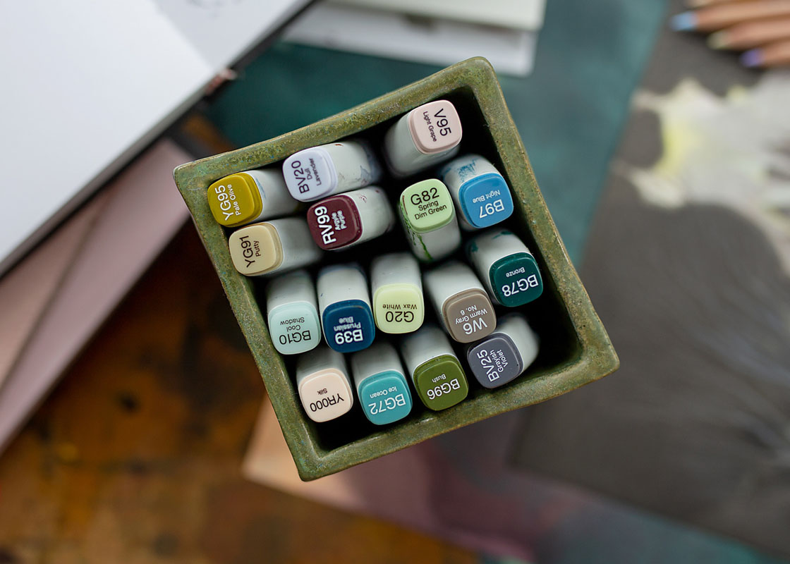
Long ago I used to make illustrations with markers, but the medium wasn’t really my thing after all, so I was left with a fairly large stock of partly used Copic Various Ink refills that I no longer needed. Some years later, during one of the Inktober challenges I participated, I suddenly felt an urge to try something completely different with ink. I remembered my leftover Copic inks and dediced to start experimenting with them.
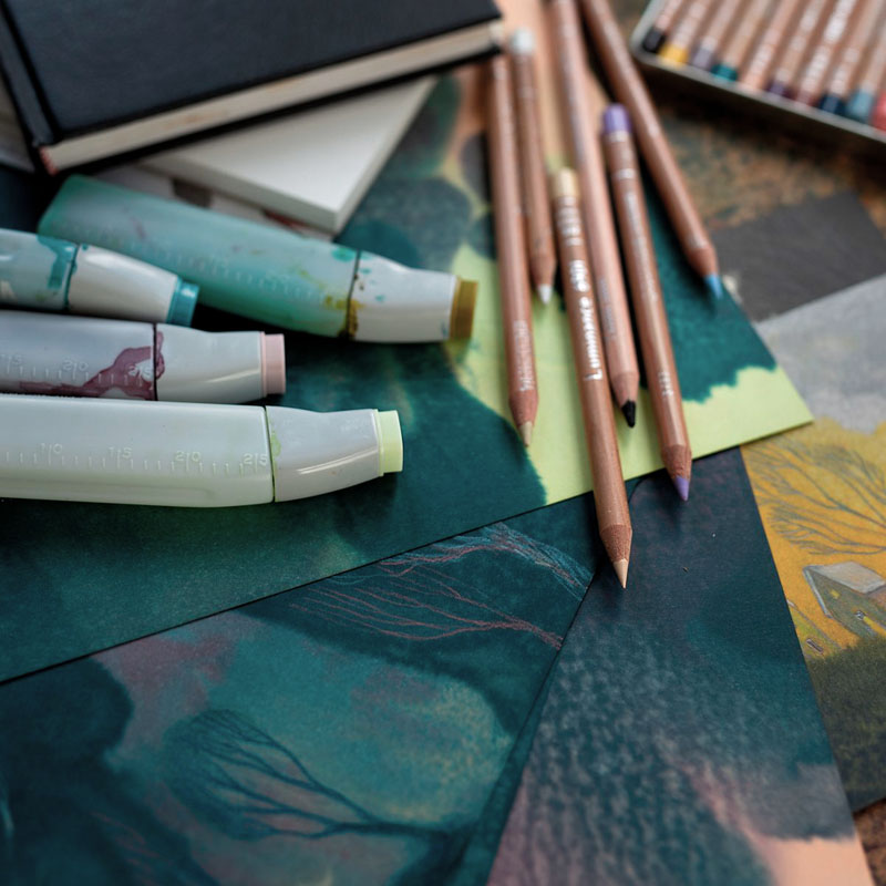
Smooth Uncoated Drawing Paper
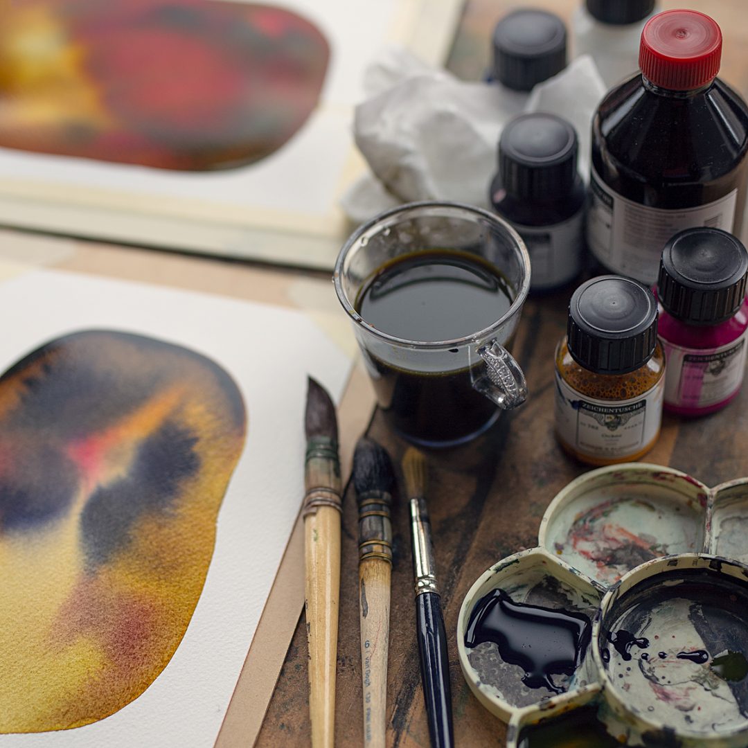
At first I just grabbed whichever drawing paper I happened to have at my studio at the time. Since then I’ve made experiments with various different papers, and each reacts a bit differently with alcohol ink. My favorites for this technique are uncoated fine grain drawing papers with smooth surface, around 200 gsm, give or take. One of the papers I use is Hahnemühle Nostalgie 190 gsm, for example. Alcohol based ink doesn’t warp or bend the paper, so there’s no need to attach the paper on a board with tape – it stays flat on its own.
Contrary to a popular assumption, I never use watercolour paper for my alcohol ink paintings – no water will be used in this technique. I don’t use any of the coated/glossy/bleedproof/plastic papers either, which are often recommended for alcohol inks. I’m partial to smooth uncoated drawing papers because of the whimsical shapes and gritty, yet rich and soft textures the paper fibers create.


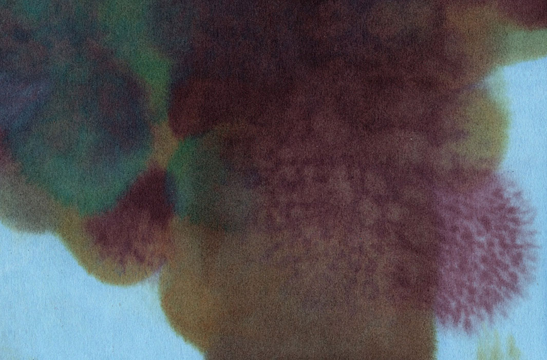
Painting Techniques
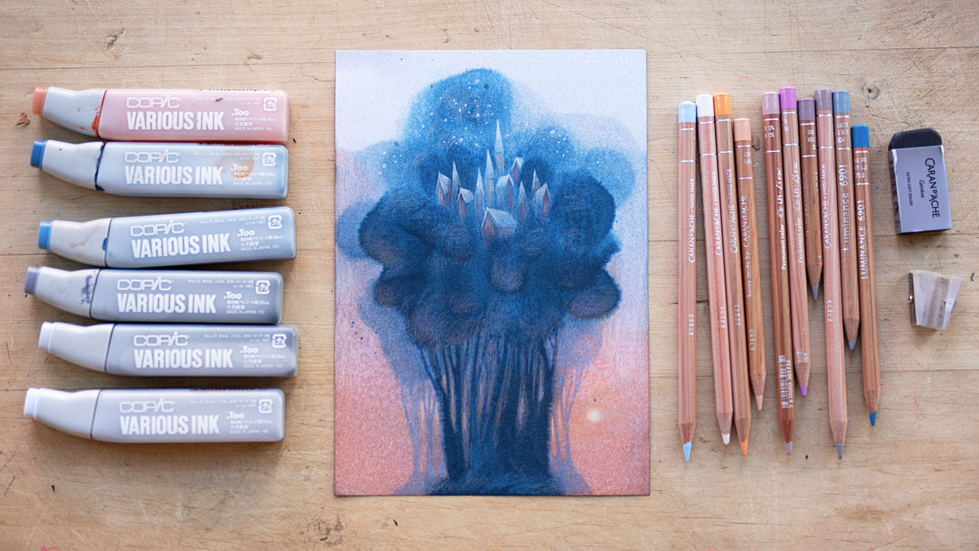
I start by simply dropping colour directly from the ink tube onto the paper. During the short time that the colour is wet, I try my best to guide the flow of the ink by holding the paper carefully from the edges and tilting it from side to side, following what the ink does.
Creating a smooth wash requires pouring a fairly large amount of ink, rocking the paper back and forth so that the ink is distributed evenly before the alcohol evaporates. Applying more paint over a wet layer creates soft blends and gradients. For more defined shape and sharper colour contrast, I wait until the previous layer is dry.
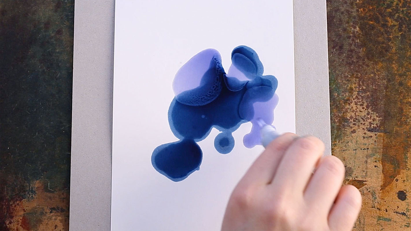
Alcohol ink is absorbed in the uncoated paper and some of the ink bleeds right through. When working with a large amount of ink I ofen keep the paper detached from the table until the ink settles, and I sometimes use tissue to remove excess ink from the edges and backside of the paper. This means that things will get messy! I use a large recycled board on top of my working station in order to protect the table from getting permanently stained. I also keep several pieces of additional cardboard or scrap paper at hand, to make sure I can always place my painting on a dry, clean surface.

The painting process is usually intuitive for me, with minimal pre-planning. I enjoy messing around with colours, following wherever they lead me. As the colour dries quickly and creates permanent stains, it requires fast reactions. Most of the decisions are made in a matter of seconds. In some cases I do have a vague idea of what I want to illustrate, which affects the painting process and my colour choices. But alcohol inks tend to be quite unpredictable and difficult to control, so I wouldn’t choose this medium if I had to follow a specific inflexible plan.

Drawing Details with Coloured Pencils
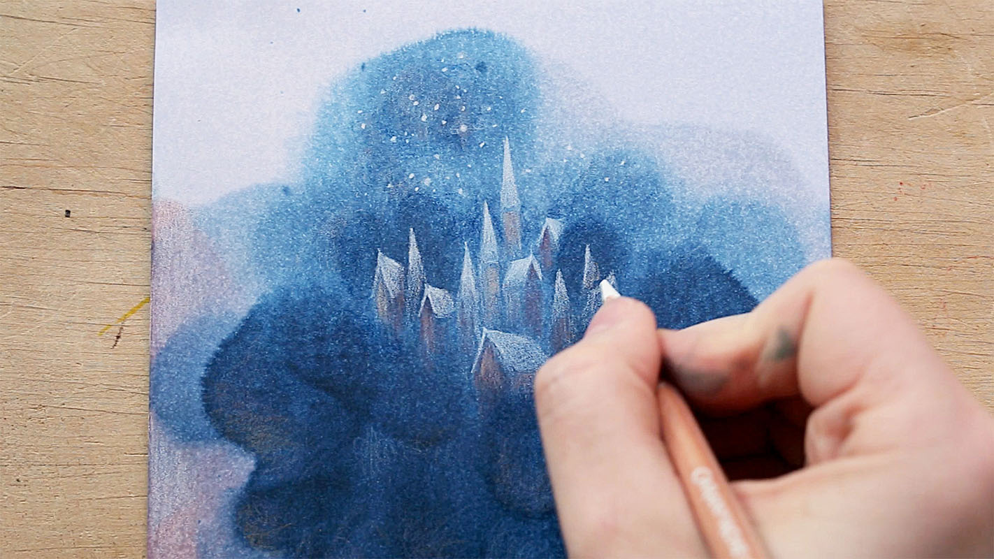
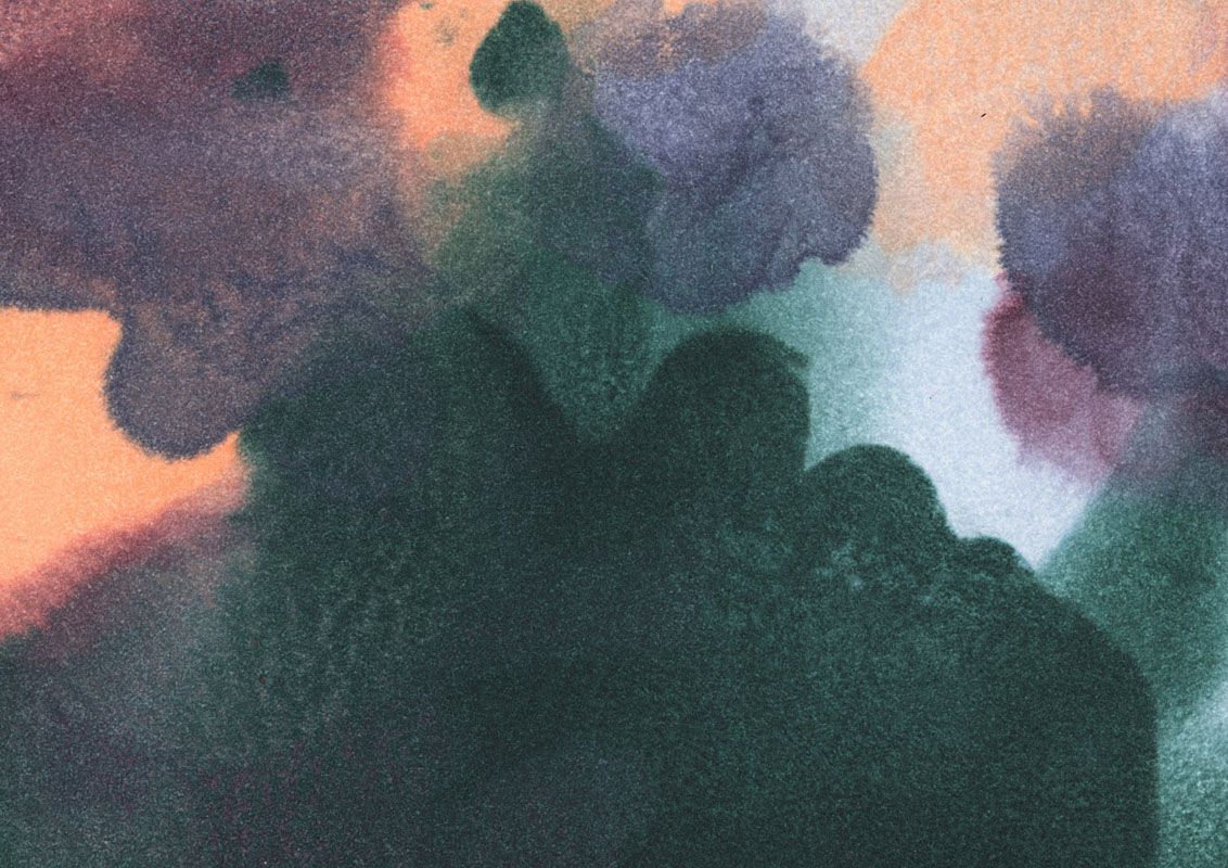
Once I’m happy with the painting, I lay it on a clean surface and let it dry completely. At this stage the painting is still abstract. For me, the painting’s colours, main shapes and textures are what set the mood and evoke my imagination, while the drawing part is what brings a sense of a story into the illustration.
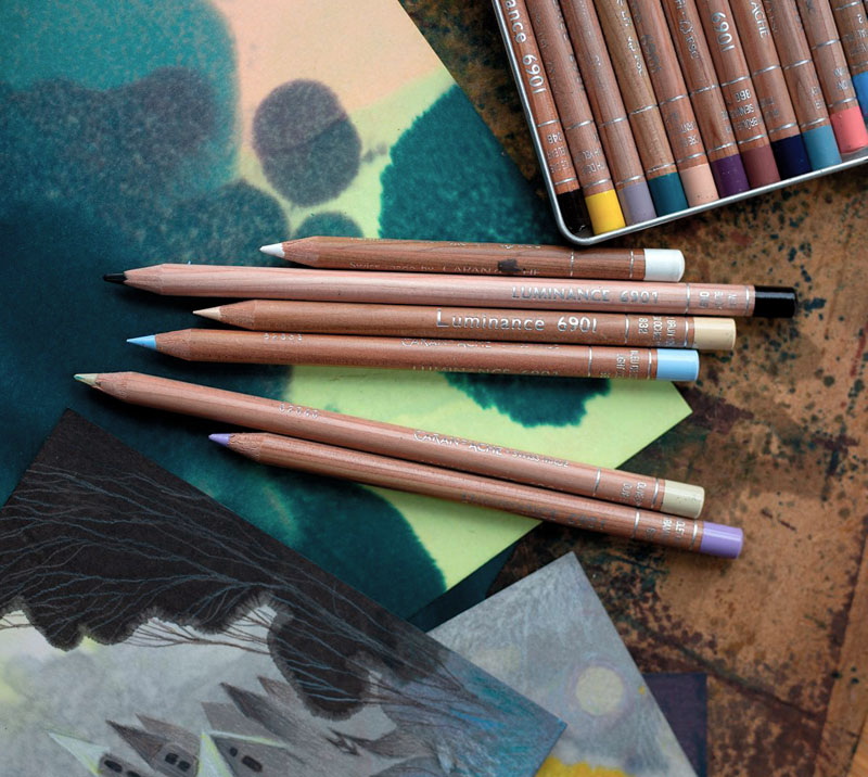
My go-to pencils are from the Luminance 6901 series by Caran d’Ache. These are very soft permanent coloured pencils and rich in pigment. They’re great for adding bright highlights over darker paintings. I just buy the individual colours that I like and need at the moment, only a few pencils at a time: fortunately my local art supply store offers a wide range of individual pencils from the series. The colours that I pick are usually from a similar palette as my inks, that way the end result turns out harmonius. Over the years my collection of pencils has grown: my favorites tend to be pastel shades and muted, greyish tones.
Creative Process and Inspiration
I’m often asked if I plan the illustrations in detail before I start. It’s complicated, in that I may sometimes have some ideas or moods in my mind that inspire me to paint or draw, but especially with this technique I like to go with the flow rather than replicate any specific picture in my head.
I usually create several paintings during one session, and then leave them to wait for further inspiration. Later on I return to my unfinished paintings and take my time looking at them, one by one, until one of the paintings starts speaking to me. The ideas come to me intuitively – I usually let the painting lead me, which feels much like following an unknown path in a thick forest. Some pieces are completed within an hour or two, others wait unfinished in the drawer for months – even a year, like the piece Heart:
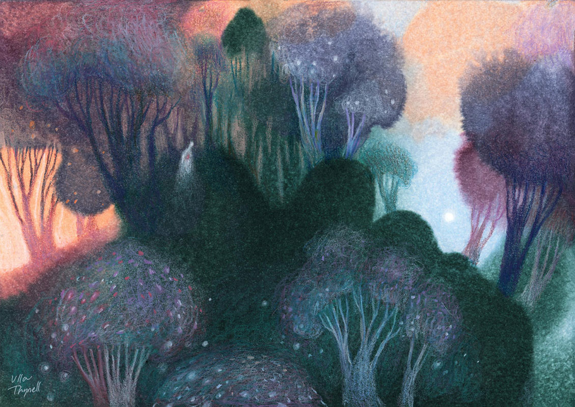
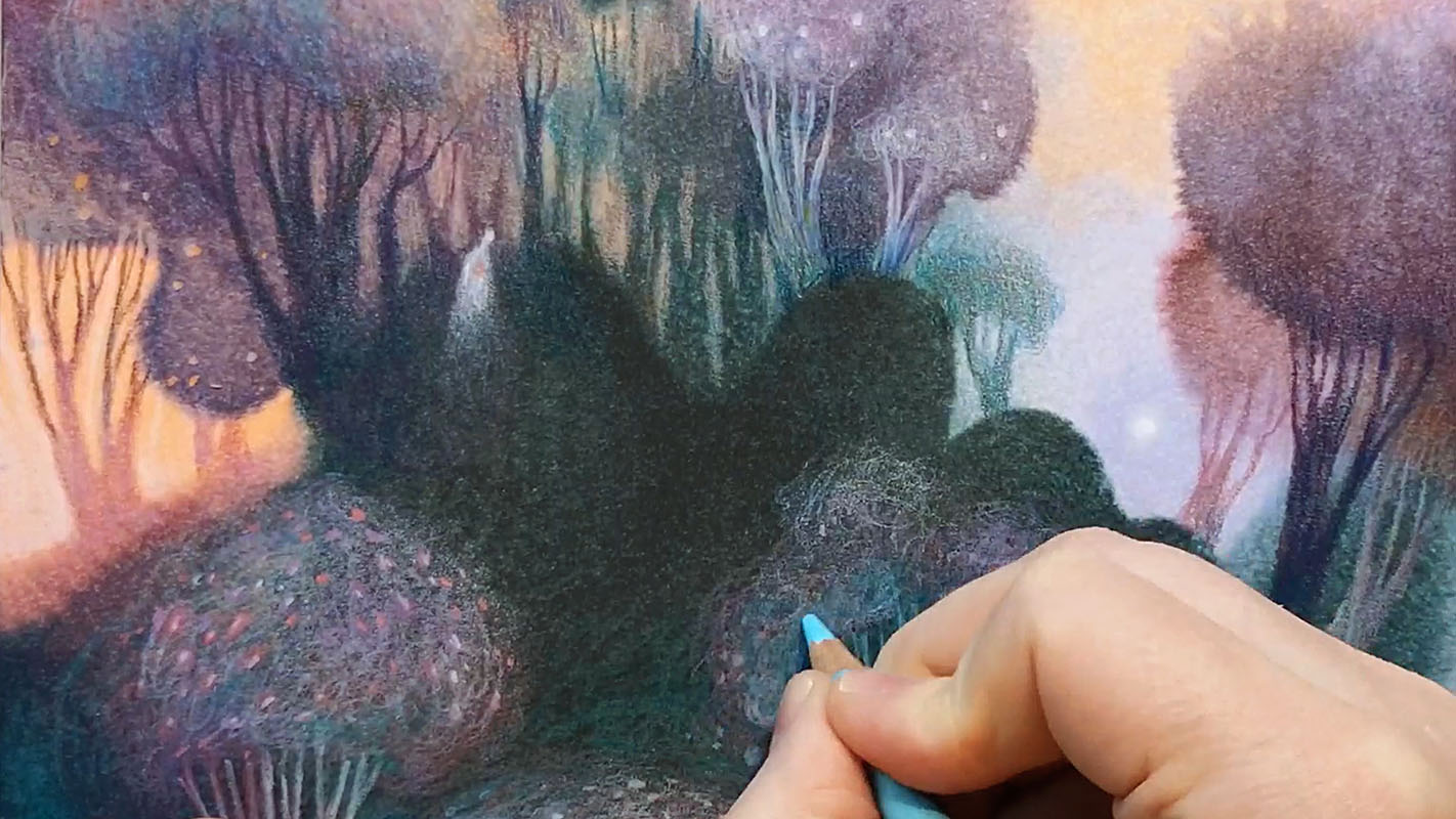
When I start drawing I don’t know exactly where the illustration will lead me – other than that it’ll most likely be somewhere in the woods. Fortunately, coloured pencils as a medium is the opposite to the inks. With coloured pencils, you can take it slow, carefully considering each step.
Whenever I’m not entirely confident with an idea yet, I sketch the faintest of lines at first, tentatively, using a colour that nearly blends in with the background, so that I can easily change the course if I start feeling like I’m on the wrong track. Coloured pencils allow erasing small areas to some extent, although I don’t usually use eraser unless I’m going to redraw on that area, because erasing may leave visible marks on the painting. Once the sketch feels right, I slowly build into it until shapes start to form.

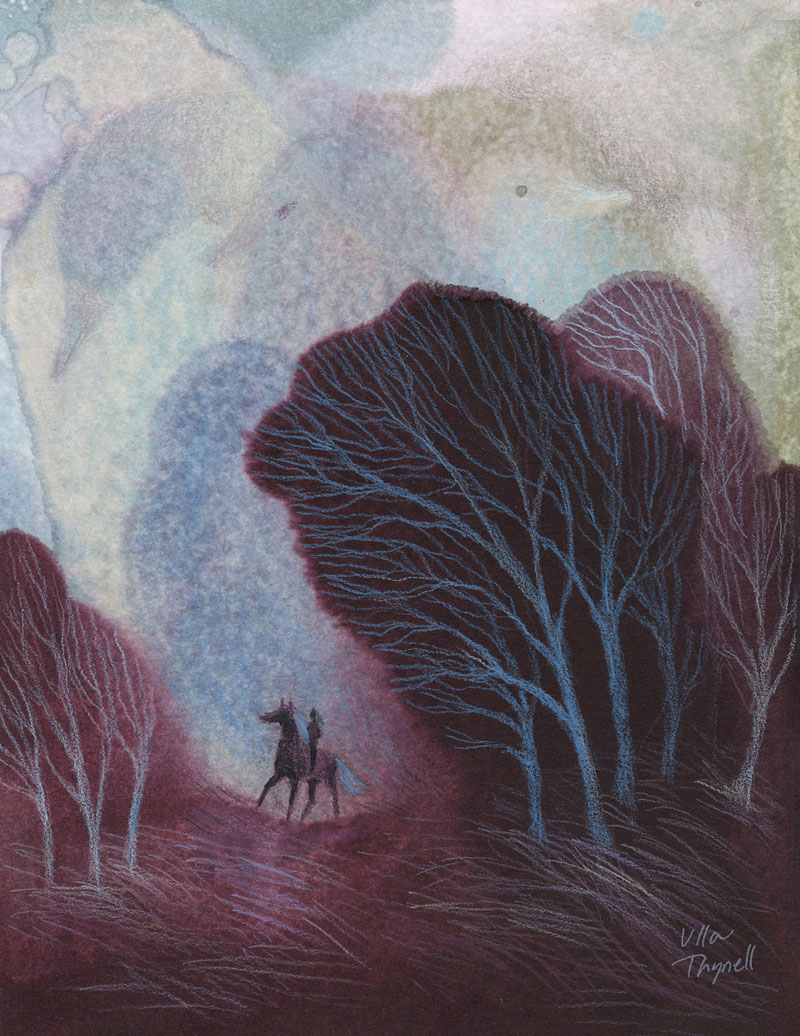
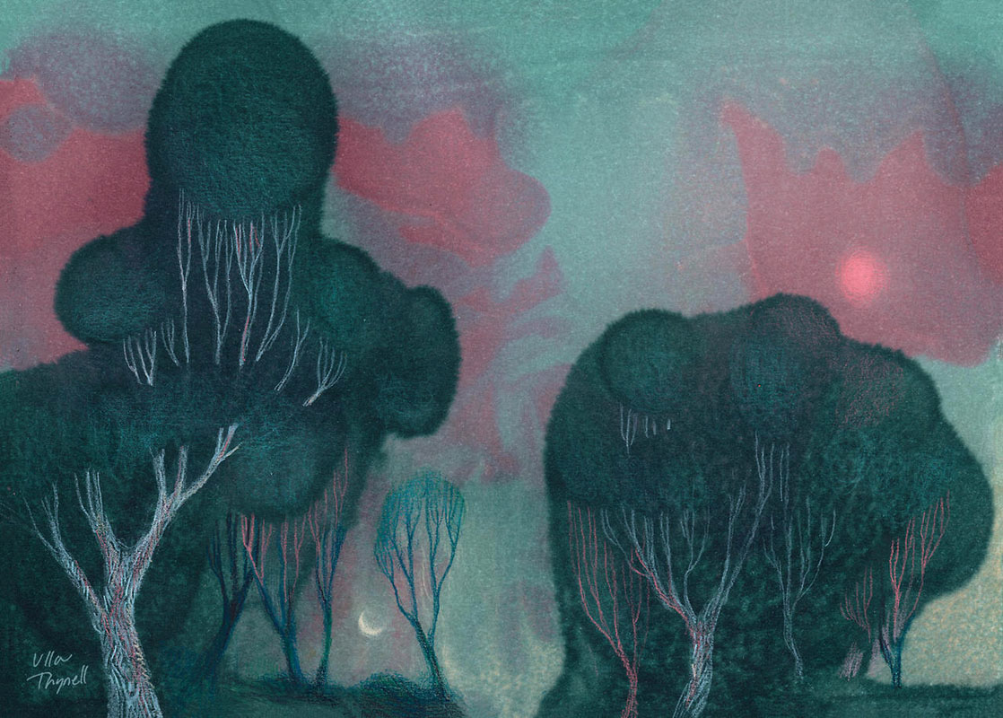
I try not to force any premeditated ideas in the illustration – I just need to trust the process and lean into it. The paintings will tell me their stories and reveal hidden figures and landscapes, if I just listen patiently enough.
The Copic ink experiment was originally supposed to be a quick one-time trial, but I fell in love with the mysterious feel of these paintings, the chaotic process and unexpected results.
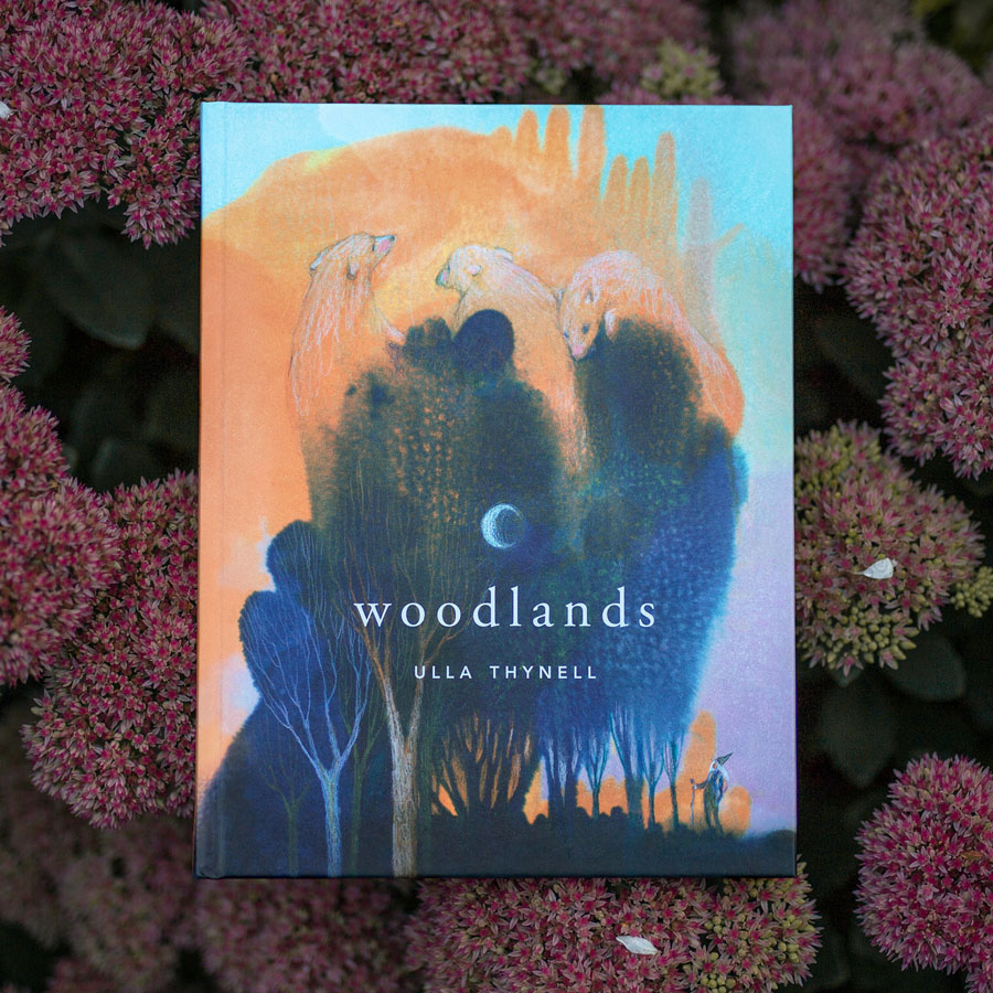
I also ended up making an entire book full of these ink paintings a few years ago: My Woodlands art book was published in 2018, and the second edition soon after. The book is sold out at the moment. Update: New, expanded edition of the book will launch on Kickstarter in 2026! Click here for more info.
Many of the illustrations from my book can also be found as art prints and posters on INPRNT (USA) and Printler (EU). INPRNT ships my prints worldwide, whereas Printler an option for those looking to buy my prints from within the European Union.
Don’t Try This at Home
Finally, a disclaimer of some sorts: I don’t really recommend this technique to anyone! To be honest it’s probably the most unpractical and expensive art technique that I’ve ever used. I wrote this post mainly because I’ve been asked hundreds of questions about this painting technique over the years, and figured it might be an interesting read to some, however it’s not really intended as an actual tutorial.
Alcohol inks are difficult to control, and they’re messy and stinky – the fumes sometimes give me headaches or make me feel weird and dizzy, even when the working station is properly ventilated. I definitely wouldn’t use these paints in a bedroom space right before going to sleep.
Most notably, using Copic Various Inks extravagantly like this is expensive. The ink refills are not cheap, and several ink tubes may easily be spent during just one painting session.
Please also keep in mind that alcohol inks are not lightfast. Using a frame with UV-filter may help a little, but I still wouldn’t recommend exposing the piece to direct light sources – sunlight or fluorescent light are particularly troublesome.
It would probably be wiser to invest your money in some other medium instead. For example, pigmented calligraphy inks are available in various price ranges and will last in use much longer, allowing you to make experiments and mistakes more freely. They are somewhat different compared to alcohol inks, though – maybe a subject for another article, later on!
Text, artworks, and photos © Ulla Thynell
